Resources for Writers
How I Navigated the Review of My Cover & Formatting
(Reflections from the other side of the self-publishing maze)
When you first receive your beautifully packaged files for review, it feels like holding your book for the very first time — and then, just as quickly, realizing the work isn’t finished yet. Here are the lessons I discovered along the way, the ones I wish someone had handed me like a lantern before I began. Each of the formats you've chosen (paperback, hardback, ebook, for example) requires two separate files, one for the interior, and one for the cover. And each of these files will be sent for your review. It can be a bit overwhelming, but take it one step at a time.
Paperback
-
Review the paperback first. Most designers build the other formats from this version, so whatever you catch here will ripple outward and save you time. You don’t need to reread the entire book cover to cover — but skim with care. Let your eye drift over the pages the way my Labrador watches for crumbs: alert, gentle, hopeful.
-
Start with the copyright page. Is the author name correct? The ISBN? Is the text exactly what you intended? I learned this the hard way when my formatter lifted my entire email — all format-specific ISBN instructions — and pasted it straight into the copyright page. The paperback was suddenly listing the ISBN for every format of my book at once. An easy fix, but a humbling one.
-
Watch for stray keystrokes. Somewhere in the process, a rogue “8” attached itself to the beginning of a paragraph, turning “As” into “8As.” Spellcheck often catches these ghosts if your own eye does not.
-
Check italics and bolding. Two of my sentences were mysteriously bolded for no reason at all — a reminder that even digital hands can fumble.
-
Look for spacing and layout issues - margins, alignment, visual rhythm. I had a letter where “Dearest Mom & Pop” clung to the very bottom of a page, alone and orphaned. I asked the formatter to shift the text so the salutation lived with the rest of the letter, preserving the emotional flow.
Hardback
-
A hardback’s trim size is larger — often 6×9 — and that shift can unsettle the layout. Widows, orphans, and odd breaks may appear even if the paperback was perfect. Review with fresh eyes.
-
And again: confirm the copyright page. My hardback file reused the paperback wording, including the wrong ISBN.
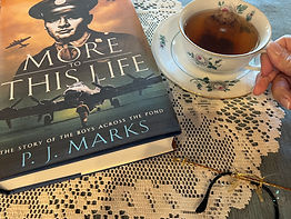
Cover Files
-
Your cover is your book’s first whisper to the world. Read every word on it.
-
Things to check:
-
Title
-
Subtitle (if you have one)
-
Author name spacing, especially if you use initials
-
Search engines struggle when metadata shifts from PJ Marks to P. J. Marks. Consistency is its own quiet form of professionalism.
-
If your hardback includes a dust jacket, check every panel — front, back, flaps. In my case, the back flap was left entirely blank where my bio and photo should have been.
Ebook
The ebook deserves the same tender attention — even if it behaves differently.
-
Confirm the copyright page and ISBN in this format as well.
-
A table of contents is standard and expected.
-
Scene breaks often lose their ornamental formatting. My three asterisks from my original manuscript were changed to an ornamental in the paperback, which was lovely. However, in the conversion to ebook, the ornamental was replaced with one asterisk. I requested they restore the trio for clarity and tone.
-
Because ebook pages are fluid, widows and orphans don’t apply. So if you see a lot of them, don't worry! The dynamic nature of the ebook format can shift lines from one page to the next, and back again.
-
Footnotes may appear as both pop-ups and endnotes. This is normal.
-
Margins may shift inward or outward on alternating pages. Also normal.
In conclusion:
Your formatter is human. Your eye is wise.
Trust both — but trust yours more.
And don't hesitate to ask questions if you're unsure.